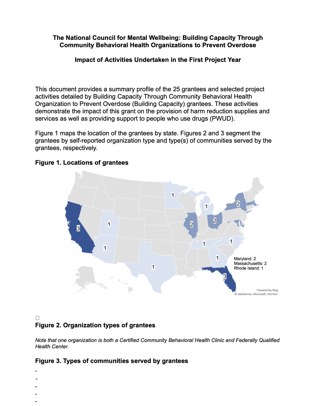
Case study: CBHO Impact Report
Making it Easy to Scan I wanted to make sure the most important numbers jumped off the page. By using bold colors and big "hero numbers," I created a layout that lets people get the big picture at a glance. It's designed so busy stakeholders can see the impact immediately without having to dig through every single line of text.
Telling a Story with Data I organized the report like a story. It starts with the big-picture stats to set the scene, then zooms in on the real people and human stories behind the numbers. This flow helps the reader move naturally from seeing "what" happened to understanding "why" it matters, making the whole experience feel more personal and connected.
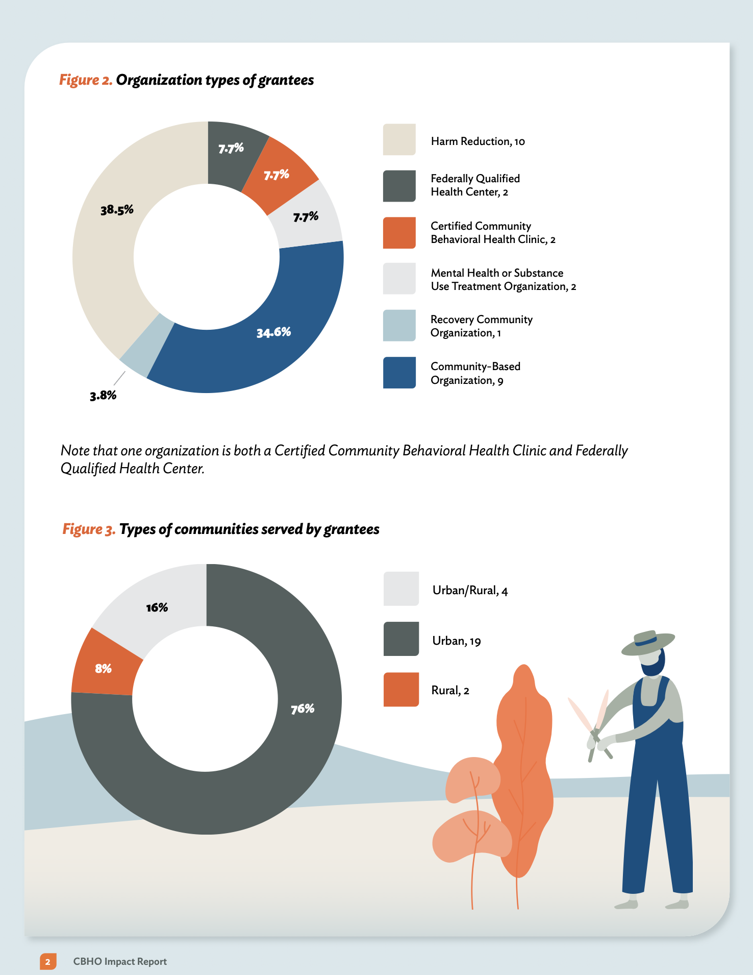
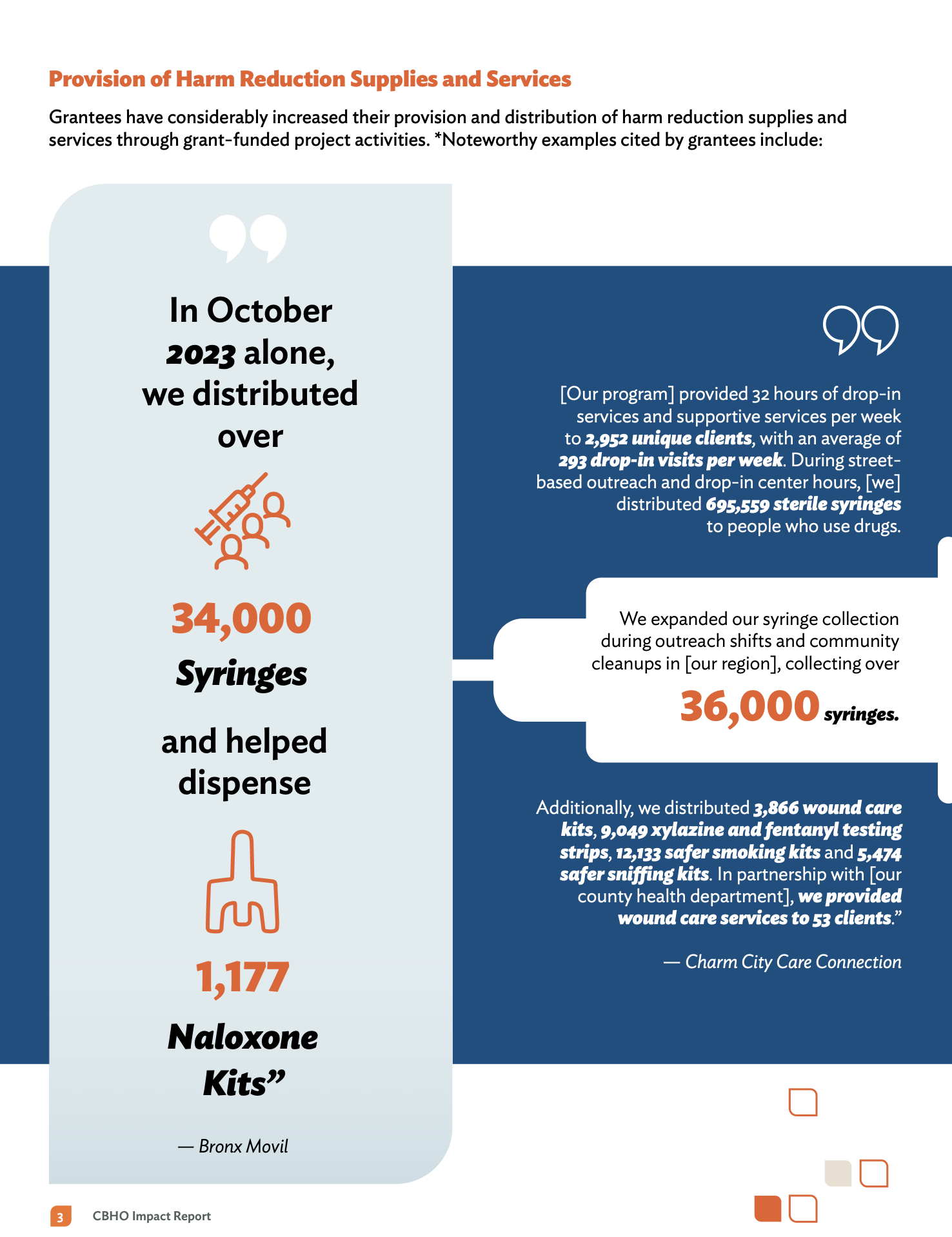
Visuals That Just Work Instead of overwhelming people with complex data, I turned those numbers into easy-to-read maps and charts. Every visual is a quick touchpoint that makes information accessible to everyone. The goal was to make the results feel clear and intuitive, so anyone—no matter their background—could walk away with a solid understanding of the project's success.
Design for Everyone For me, accessibility is a must-have, not a "nice-to-have." I used my 508 compliance expertise to make sure this report works for everyone, including people using screen readers. By focusing on things like clear contrast and legible fonts, I made sure that the impact of this work is accessible to the entire community, no exceptions.
Before and After
Kaiser Permanente
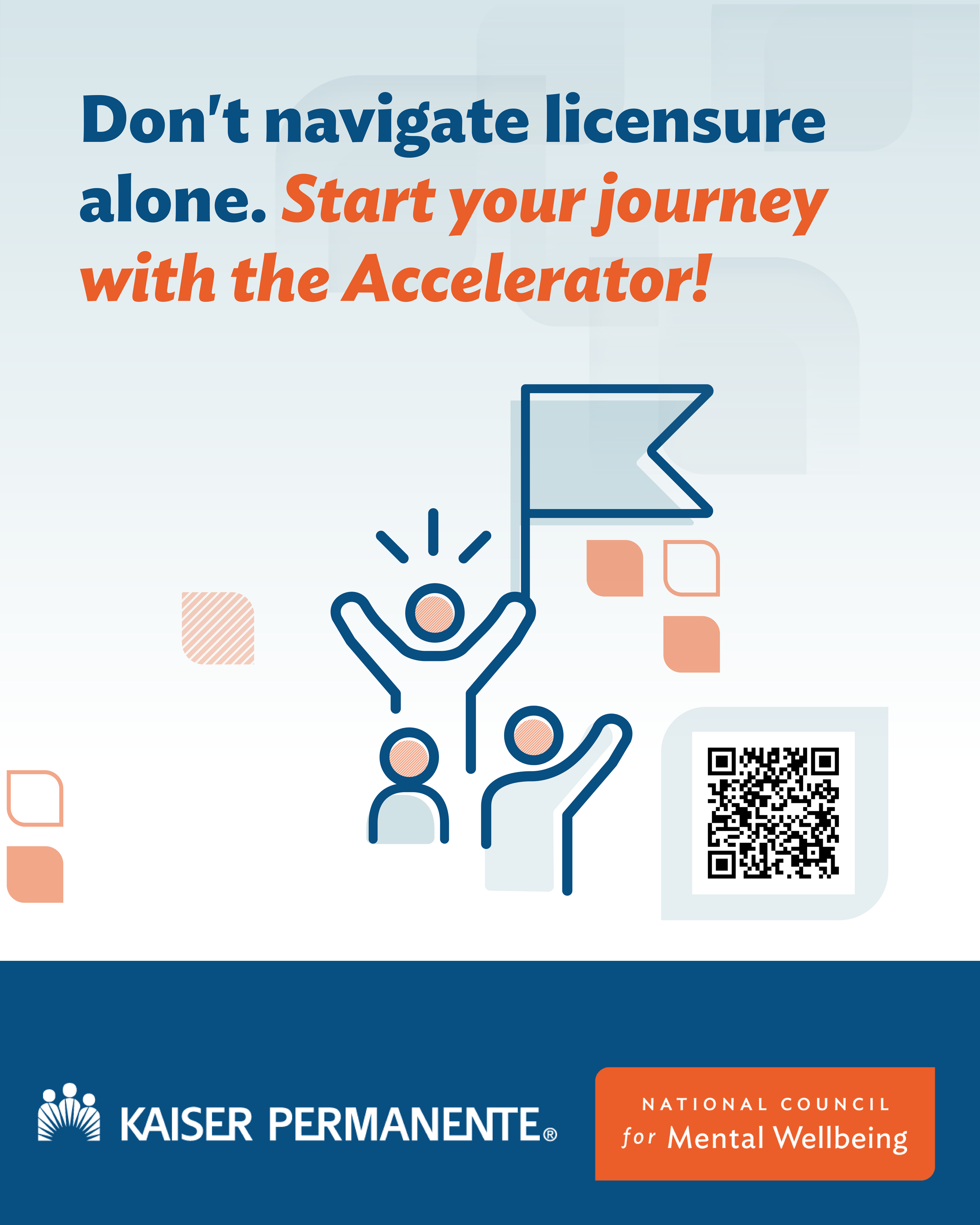
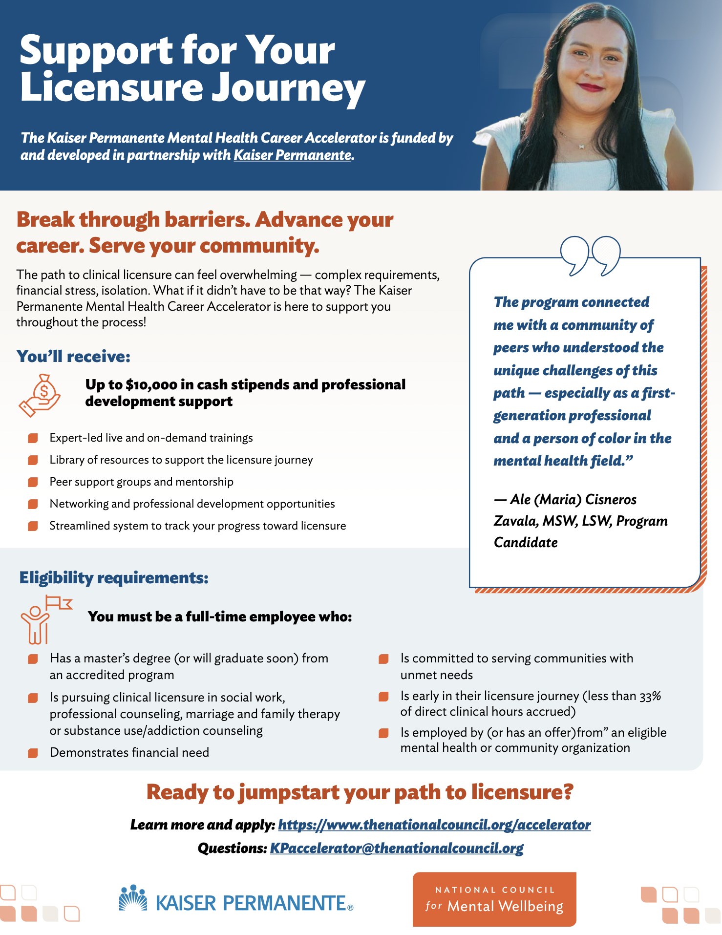
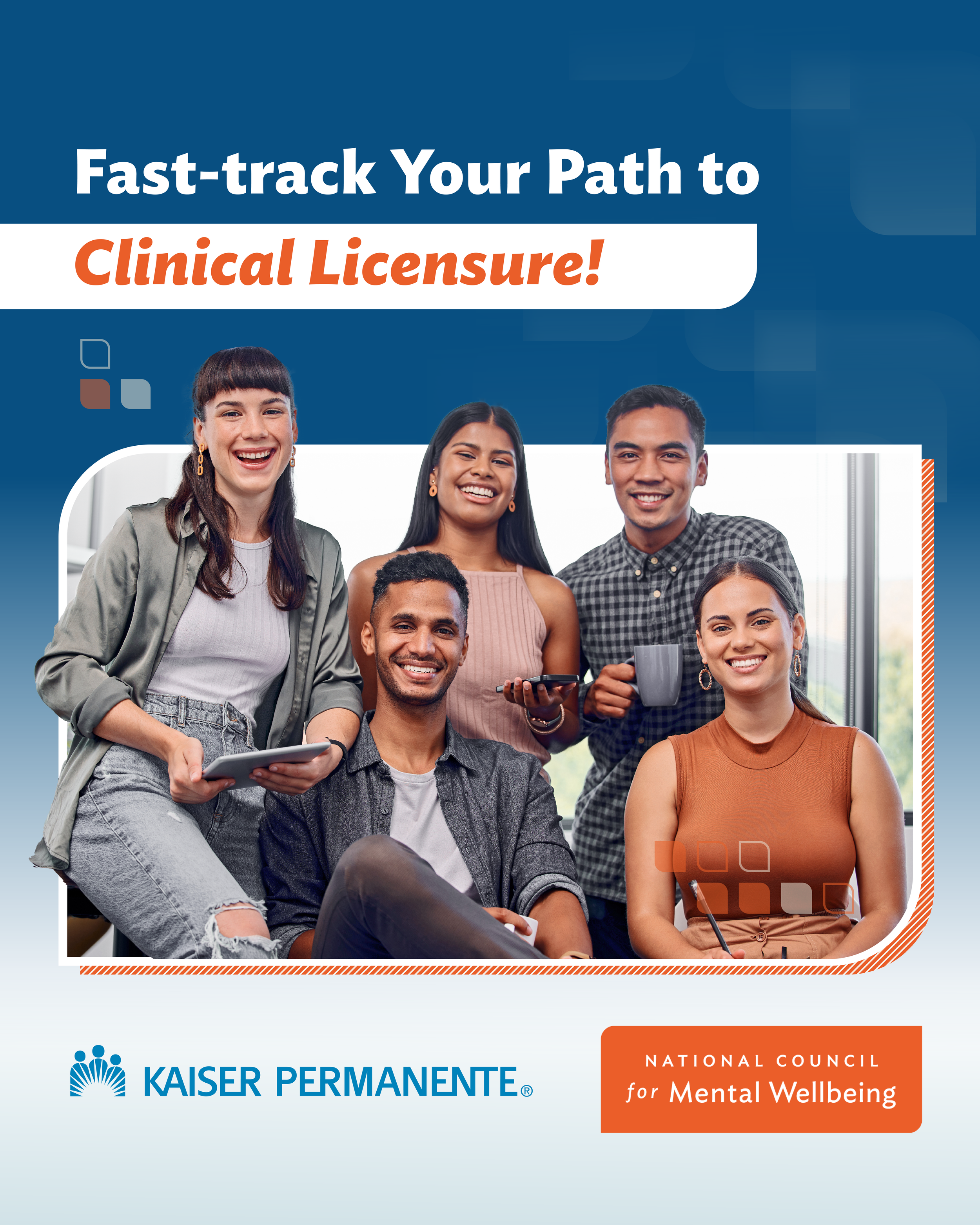
Case Study: Streamlining the "Join the Accelerator" Experience
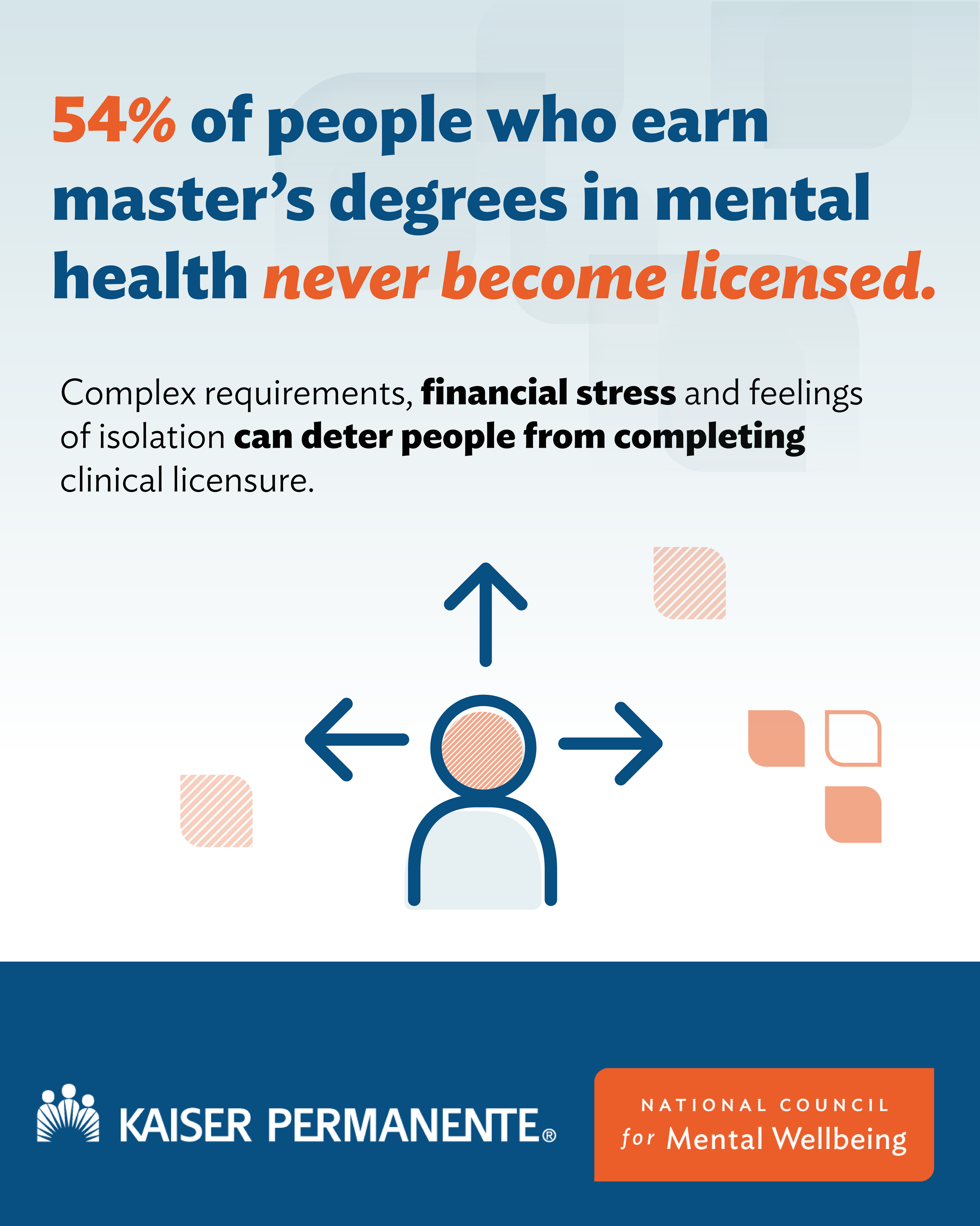
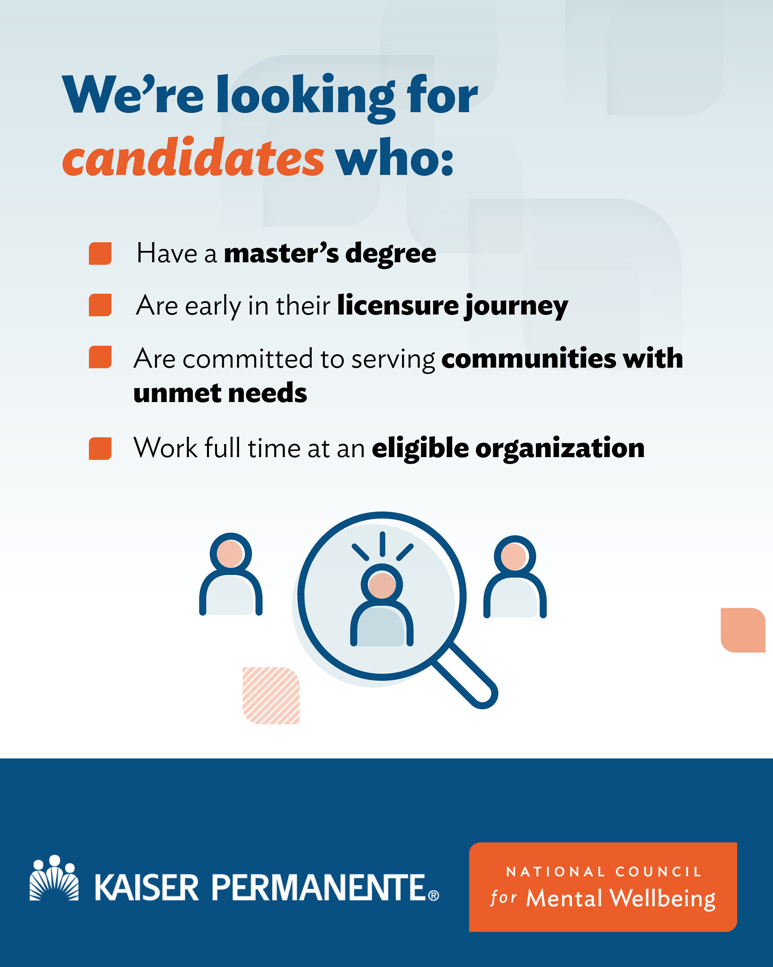
The Challenge The National Council’s Accelerator program involves a complex, multi-step application process and a detailed curriculum. The existing information was dense and difficult to navigate, leading to high drop-off rates and confusion for prospective applicants.
The Goal Redesign the landing page to simplify the user journey, clarify the timeline, and drive high-quality applications through a more intuitive, interactive interface.
My Approach (UX & Information Strategy)
Information Architecture: I audited the existing content and restructured it into a "Progressive Disclosure" model. Instead of overwhelming the user with everything at once, I used interactive cards and expandable sections to let users explore the curriculum at their own pace.
Interaction Design: I designed a visual, interactive timeline that broke the multi-month program down into clear phases. This allowed users to immediately understand the time commitment and key milestones without reading paragraphs of text.
Strategic CTAs: I mapped out the user's emotional journey and placed high-contrast "Call to Action" buttons at key decision points, ensuring the path to application was always visible but never intrusive.
Accessibility First: As with all my work, I ensured the interactive elements were fully keyboard-navigable and screen-reader friendly (Section 508 compliant), ensuring the program was accessible to all mental health professionals.
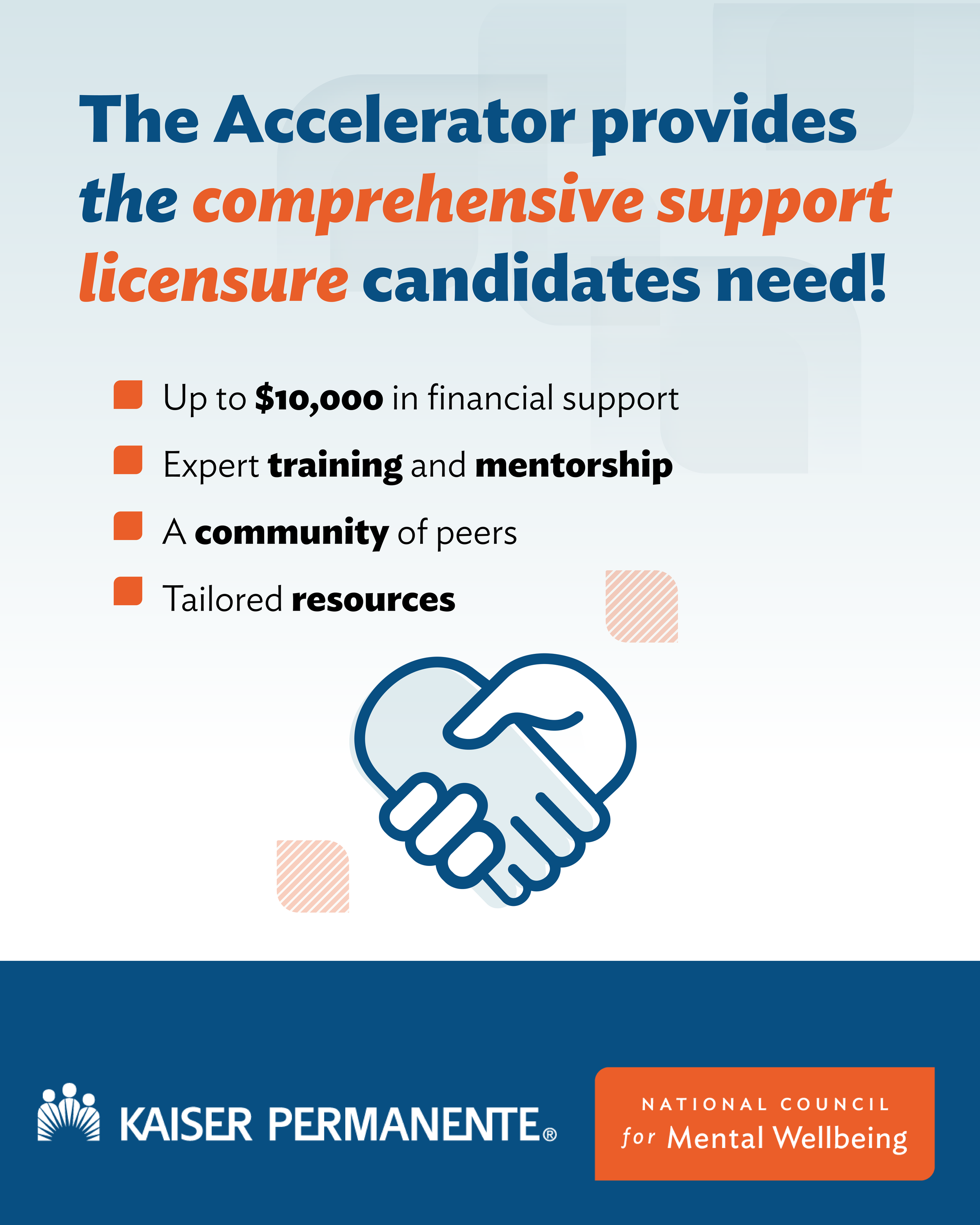
The Result: I developed a custom campaign landing page to support recruitment for a national workforce initiative, delivering a seamless user experience and enabling us to exceed our applicant goal (122% to goal). The redesign transformed a text-heavy document into a strategic web experience. Stakeholders noted that the new layout felt significantly more "professional and approachable," making the complex program feel manageable and inviting. The goal of the Accelerator Campaign launched by the National Council for Mental Wellbeing and sponsored by Kaiser Permanente is to licensed 1000 people by 2008. So far as of May 16th 2026 more than 370+ students have enrolled.
Landing page:https://www.thenationalcouncil.org/program/accelerator/join-the-accelerator/
Kaiser Permanente Socials


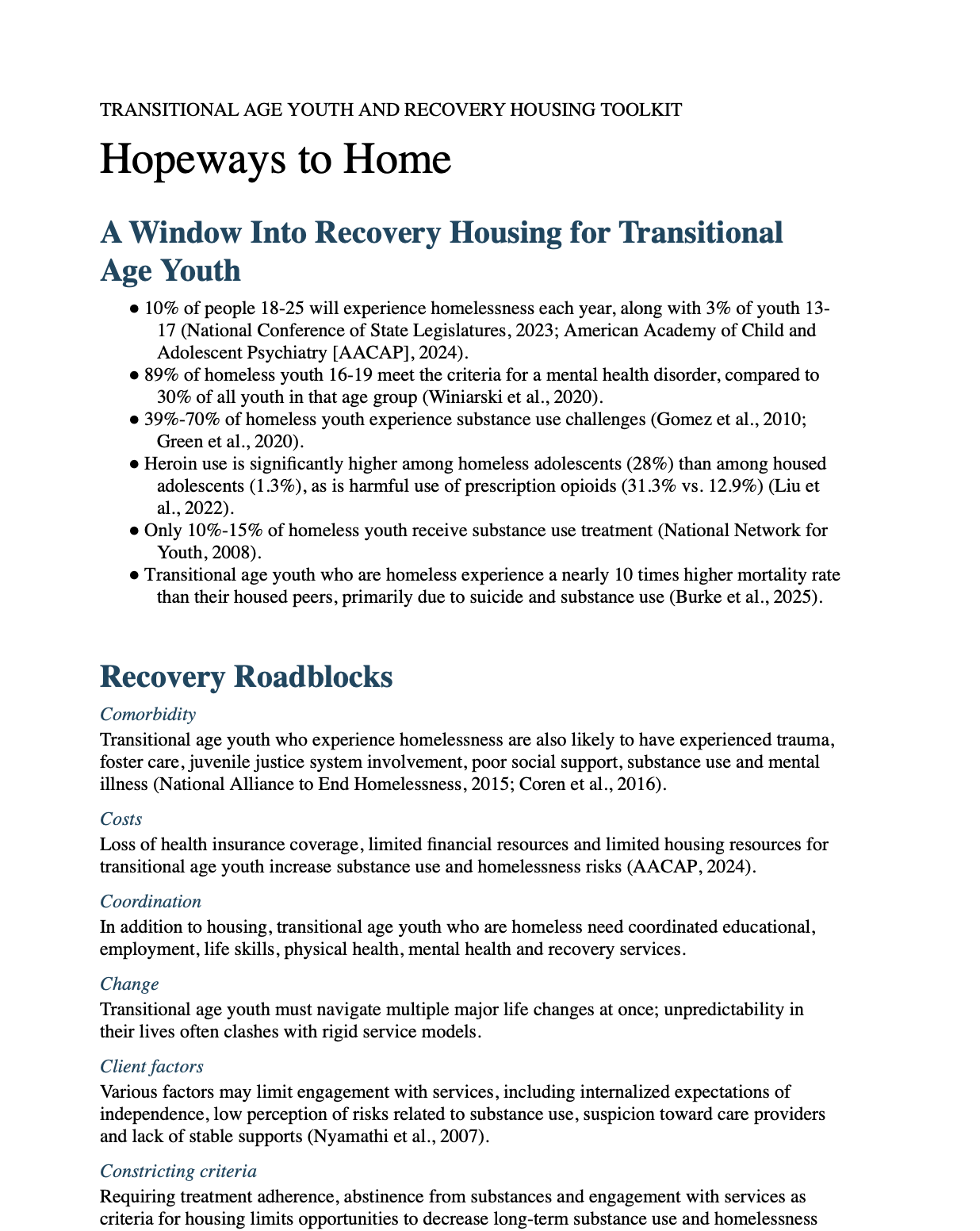
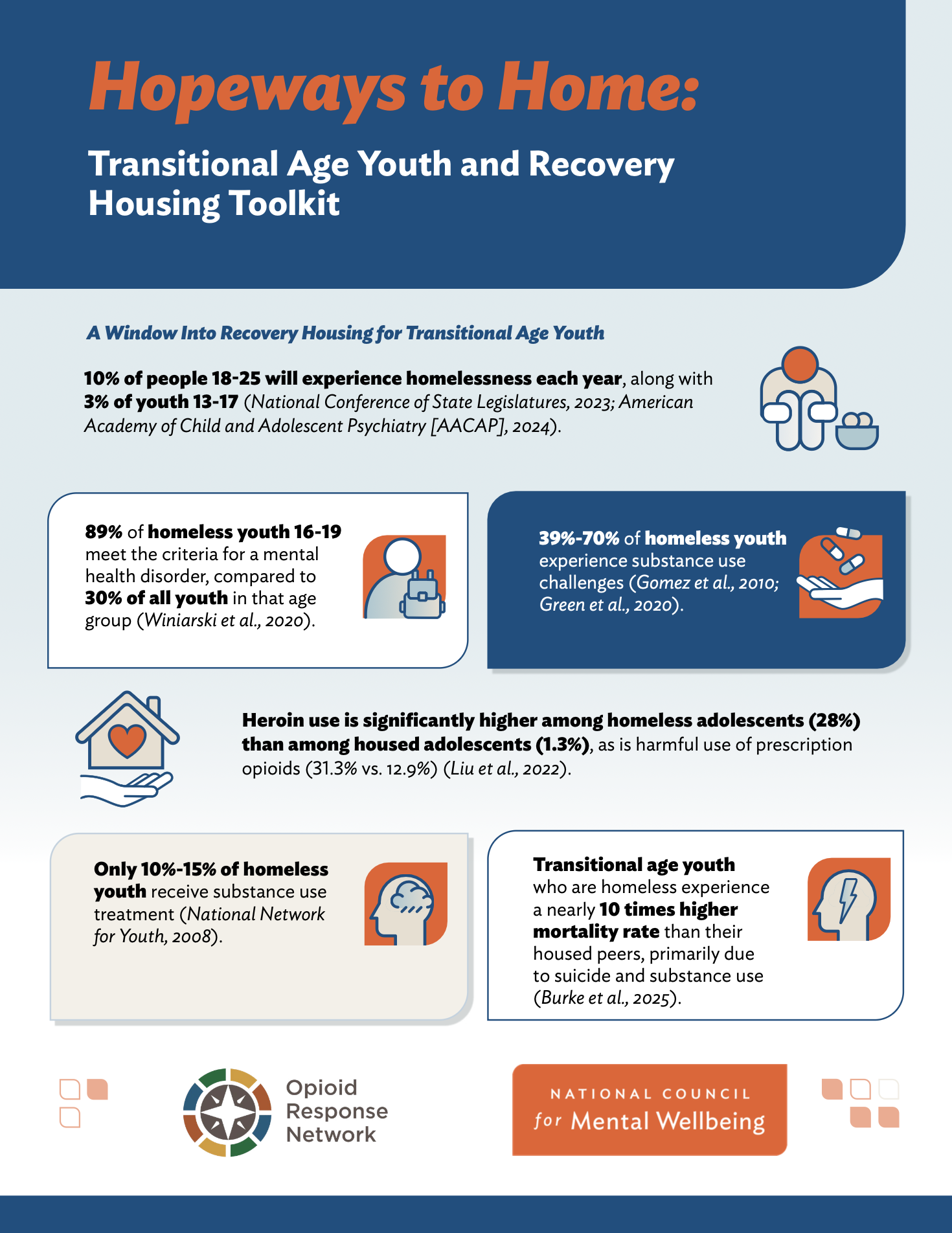
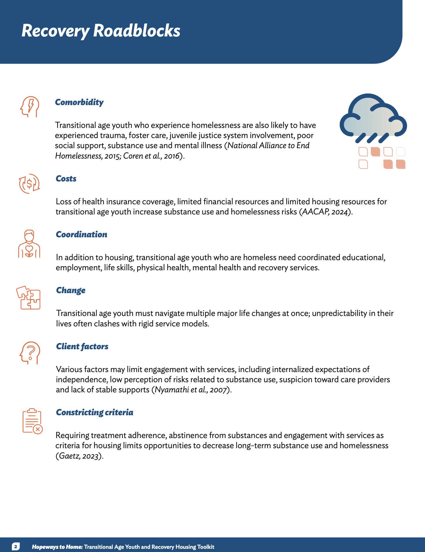
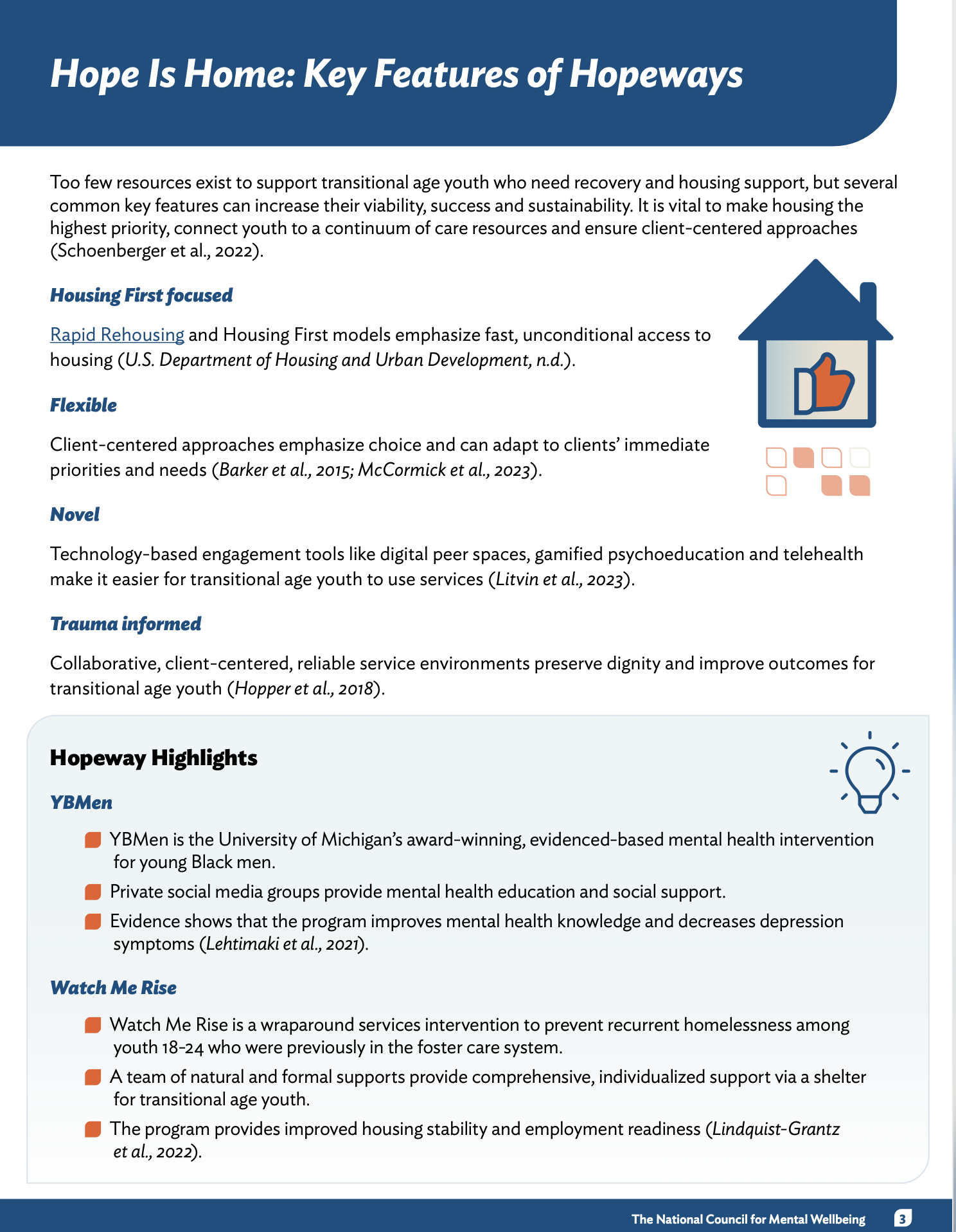
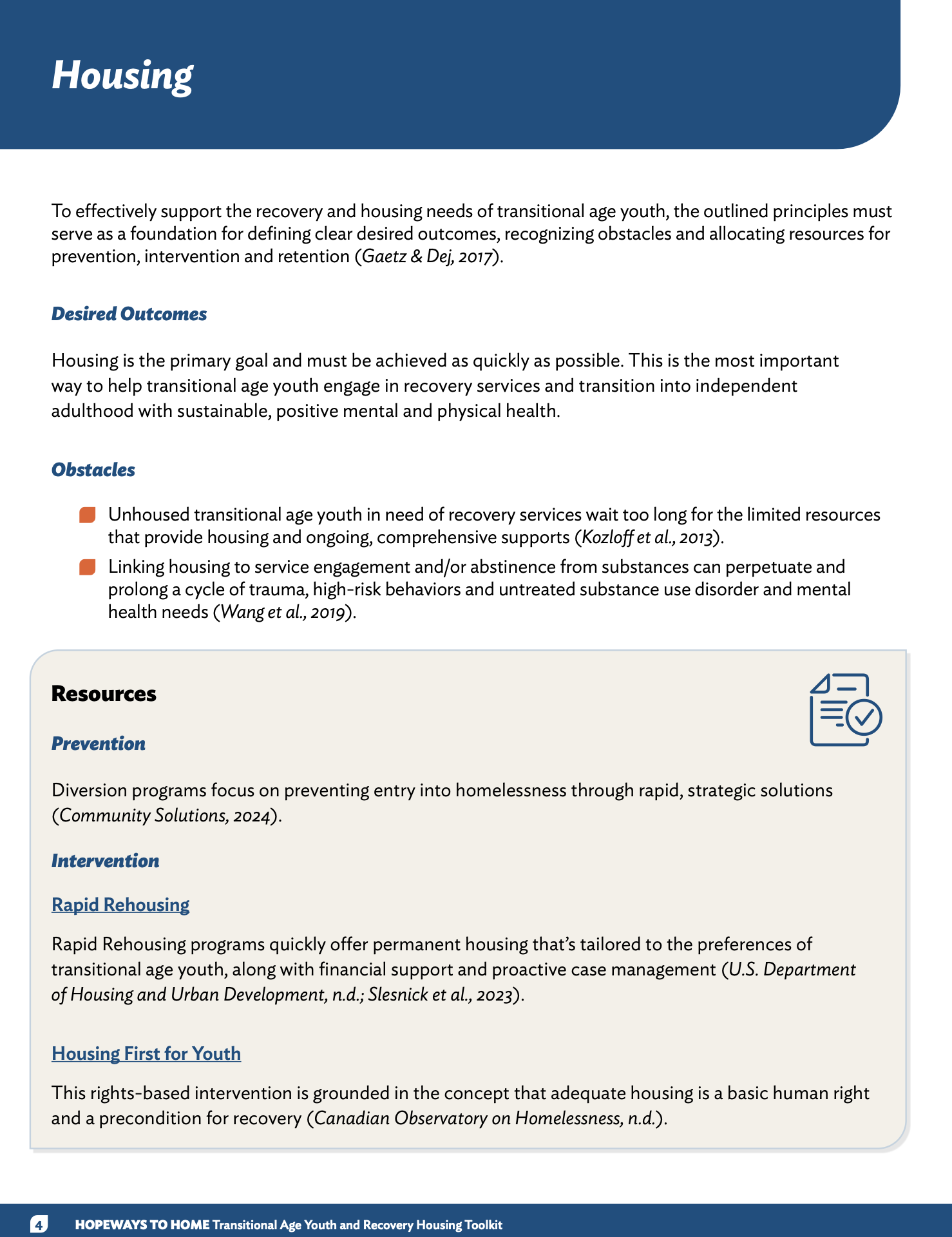
Case study: Hopeways to Home toolkit
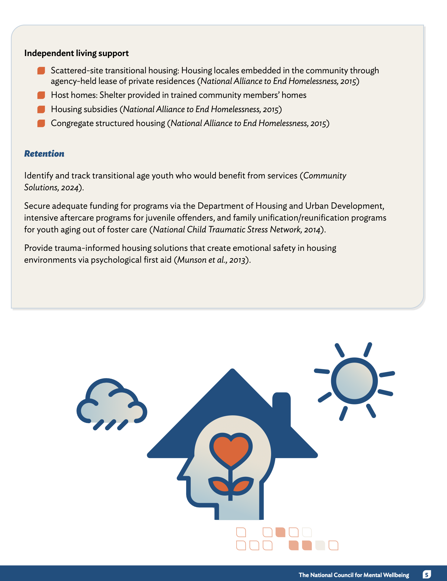
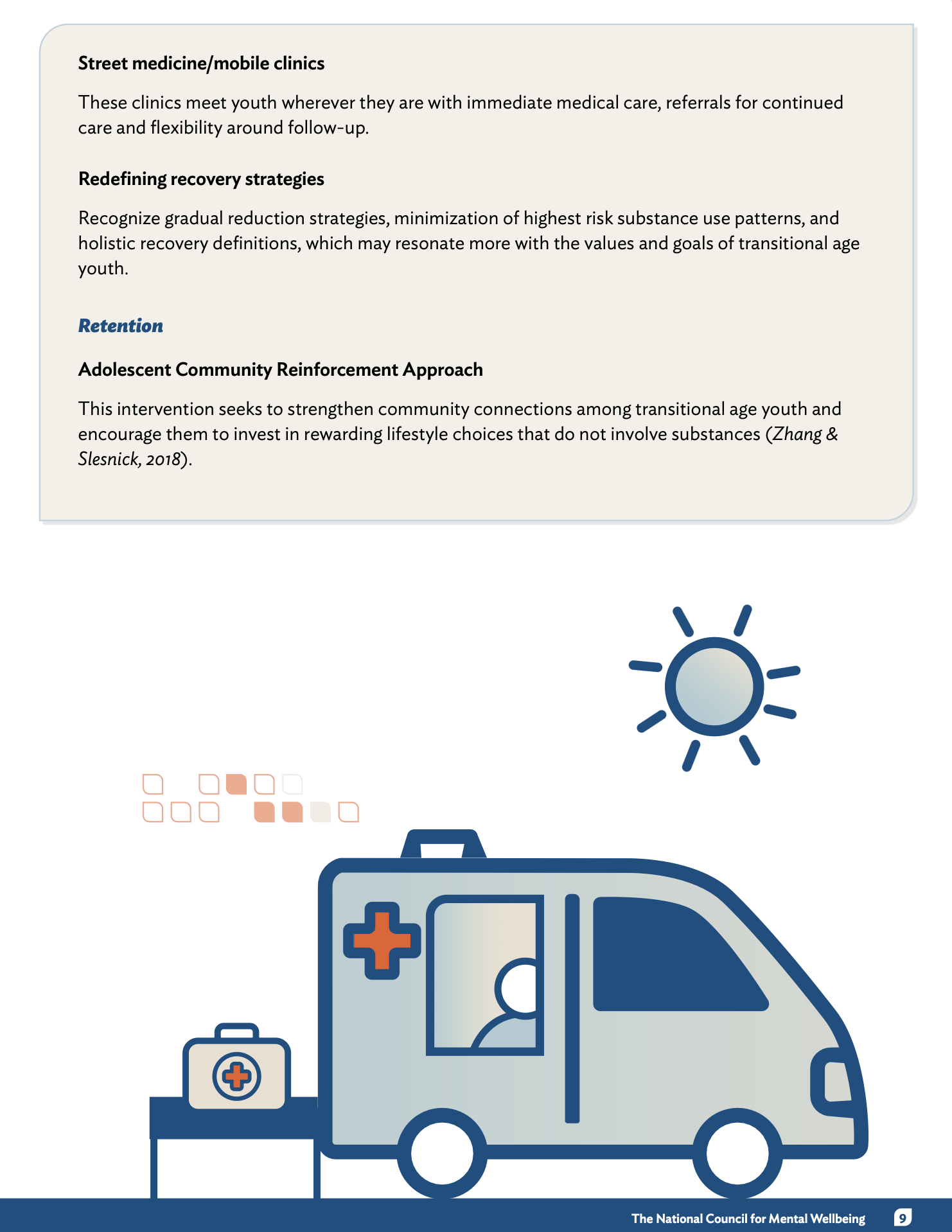
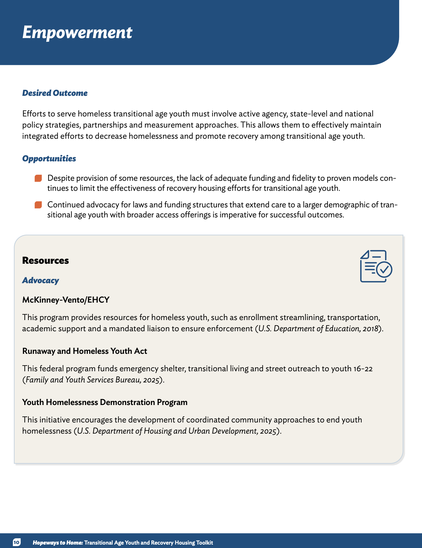
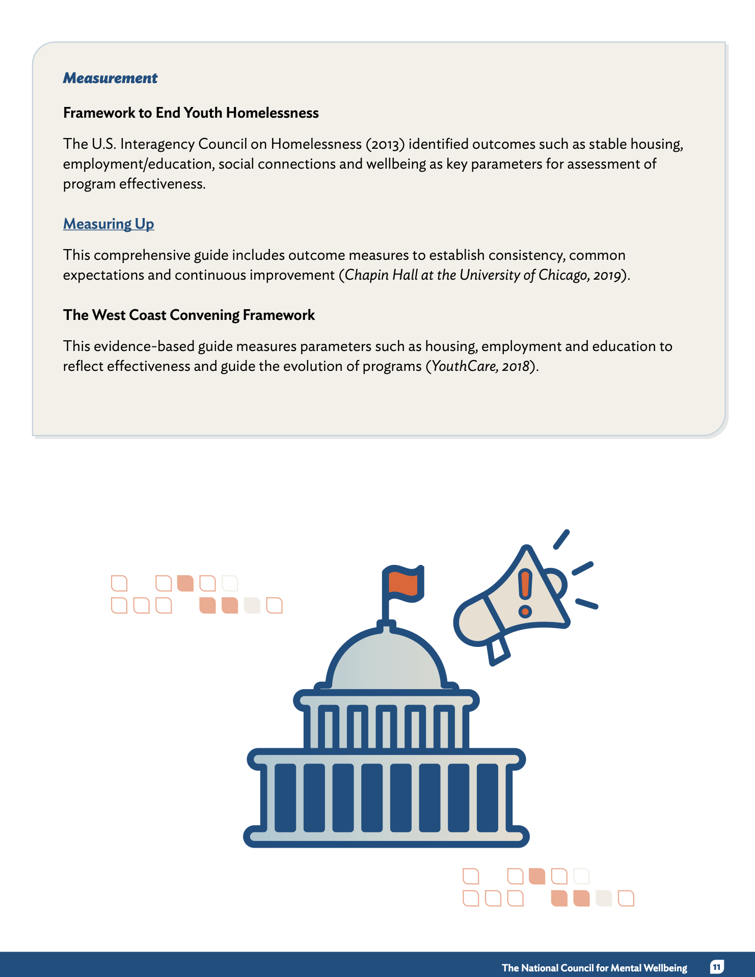
Friendly Data Visuals I turned heavy statistics into easy-to-digest infographics using custom icons and color-coded boxes. By breaking down big numbers into bite-sized visuals, I made the data feel more human and less overwhelming, helping readers connect with the story behind the stats right away.
Simple, Intuitive Navigation I structured this toolkit so it’s incredibly easy to find exactly what you’re looking for. By using a consistent "Outcome vs. Obstacle" framework across every page, I created a predictable rhythm that helps users navigate deep research without getting lost in the details.
Purposeful and Clean Layout Every page uses a clear grid and plenty of white space to keep the information feeling organized and professional. I made sure to balance the technical text with "Hopeway Highlights"—real-world success stories that give the reader a visual break while providing practical inspiration.
Design for Everyone Just like with my other projects, accessibility was a top priority here. I followed Section 508 standards to ensure the document is fully screen-reader friendly and used high-contrast colors so the vital resources in this toolkit can reach and help as many people as possible.
After
Before
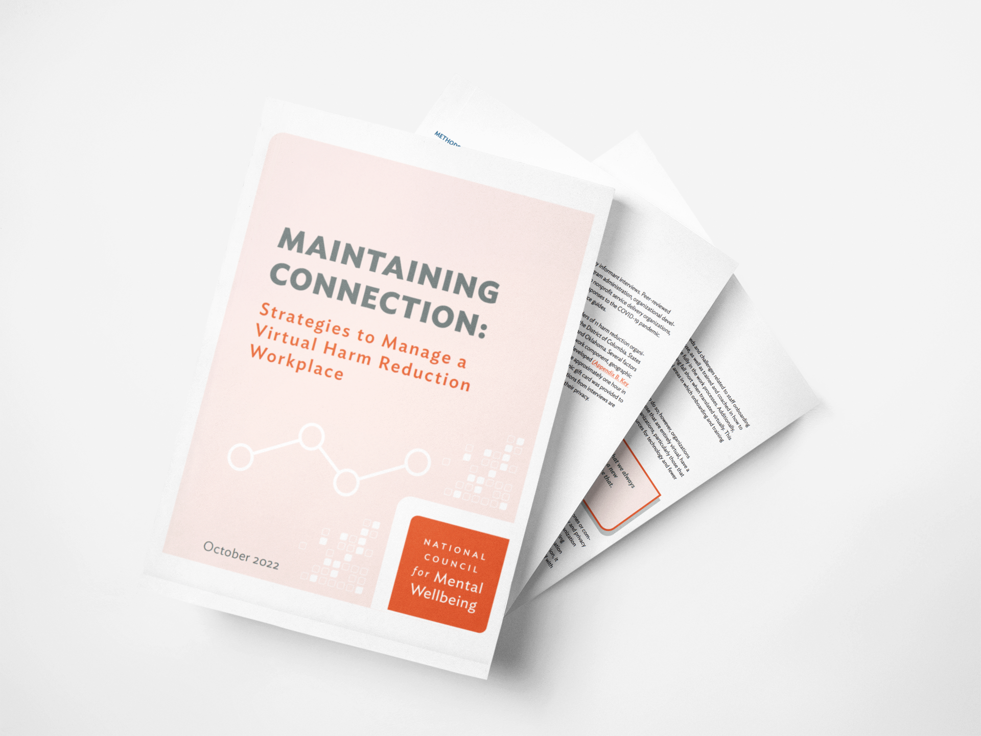
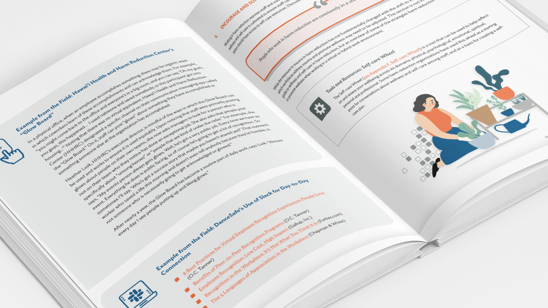
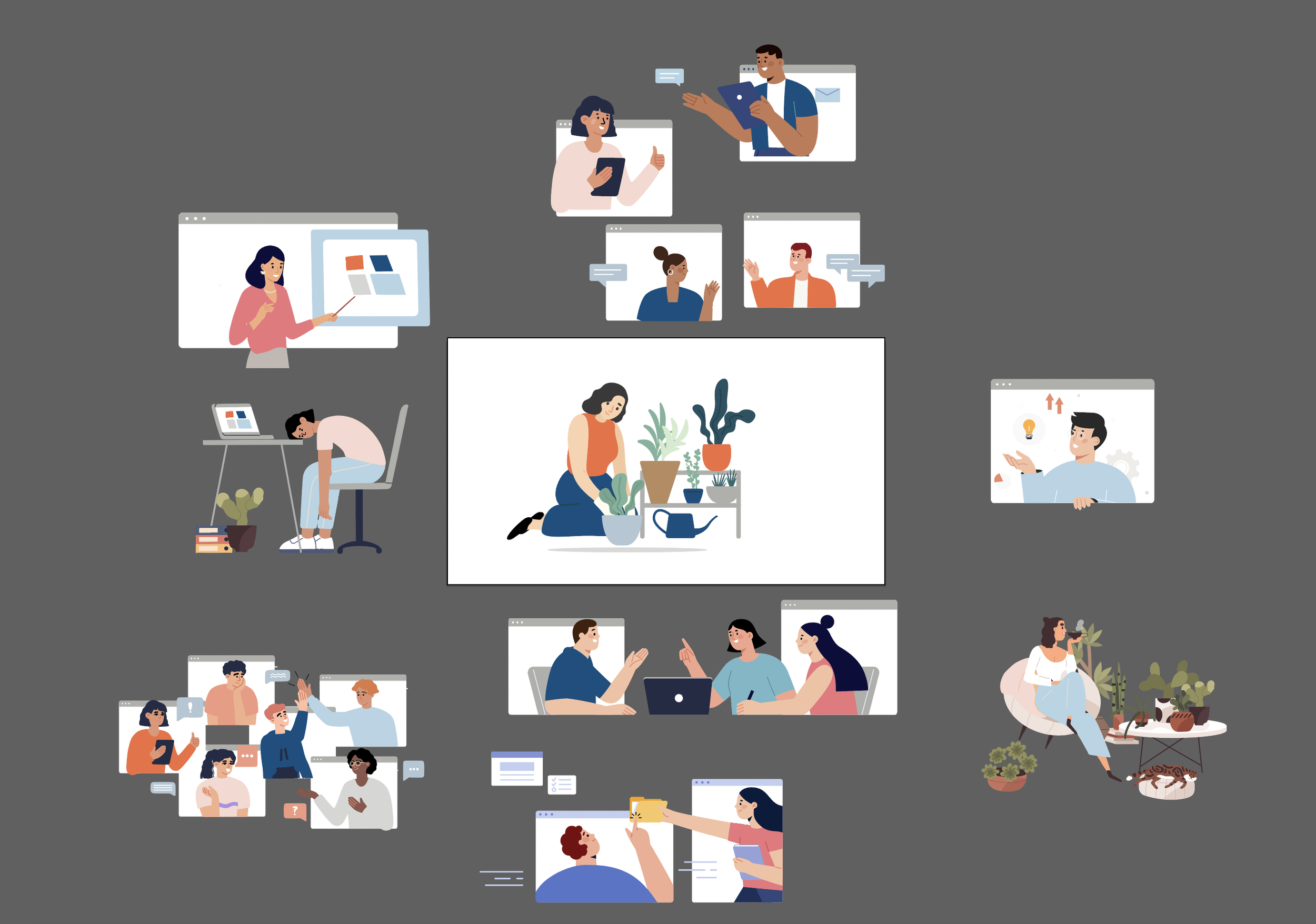
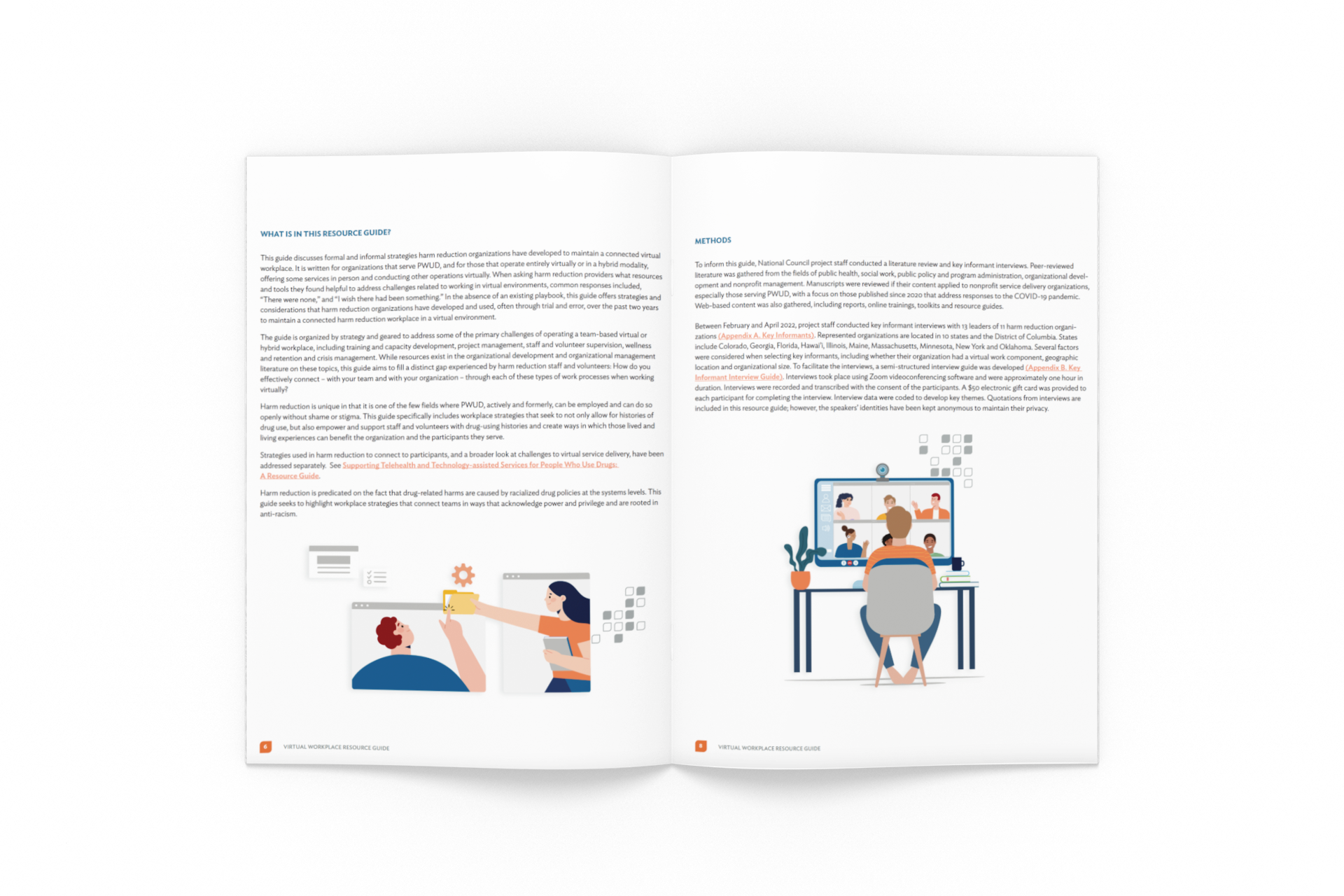
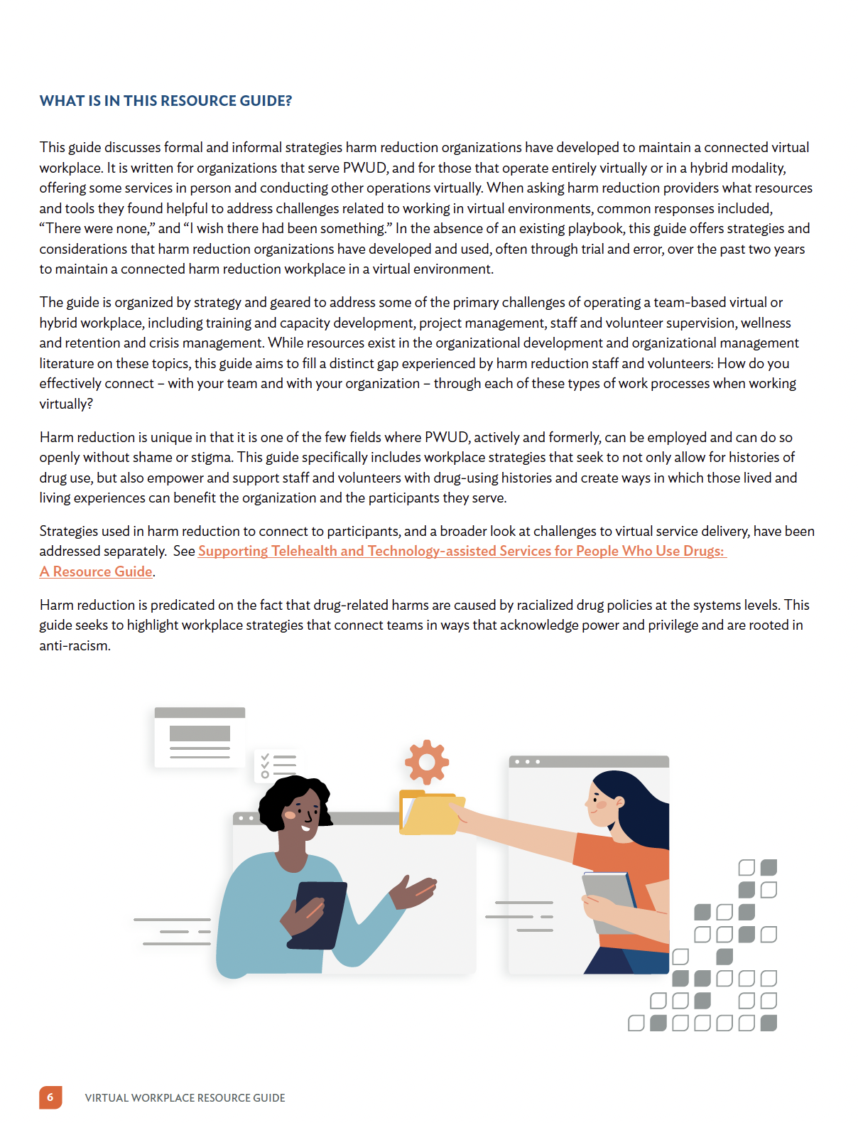
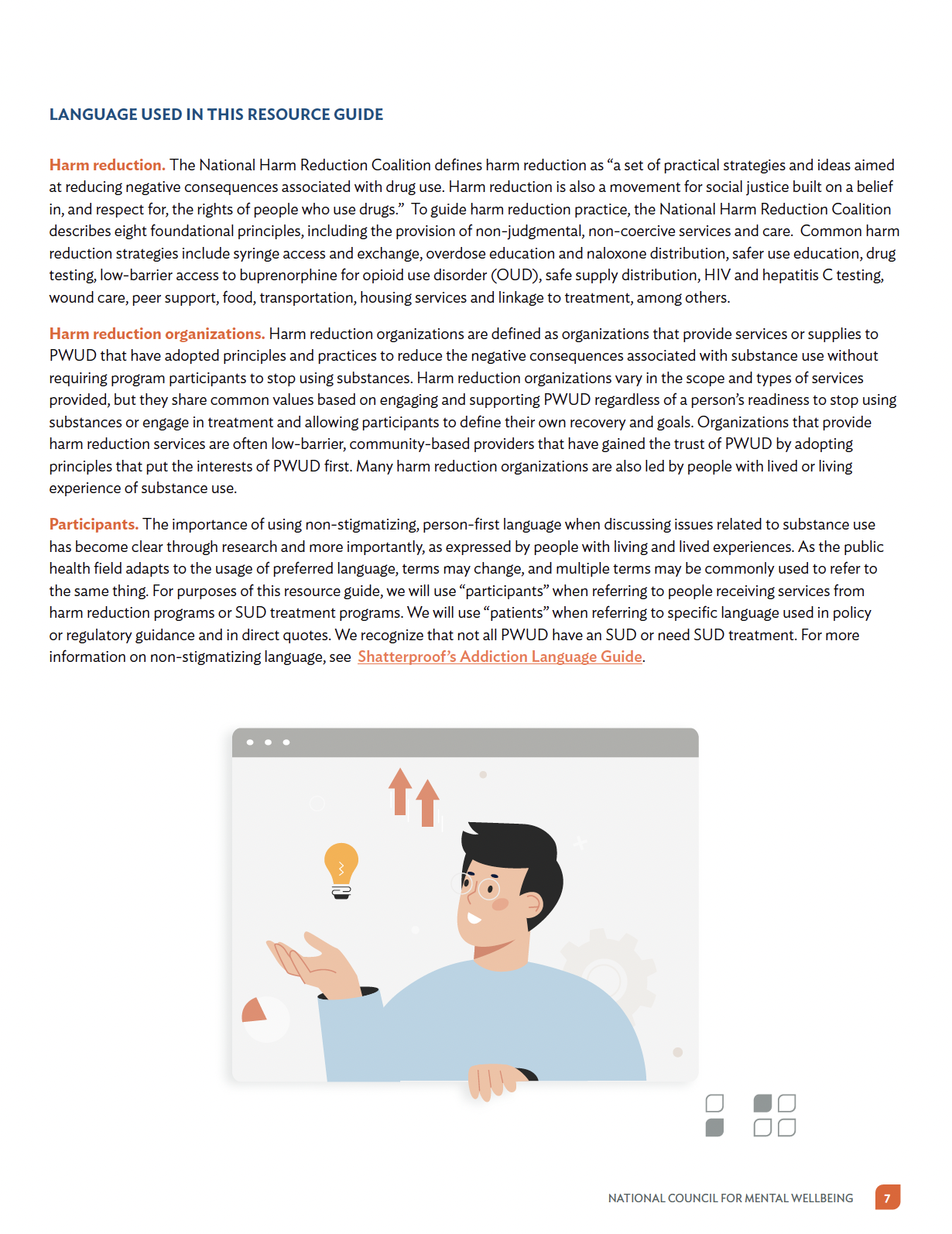
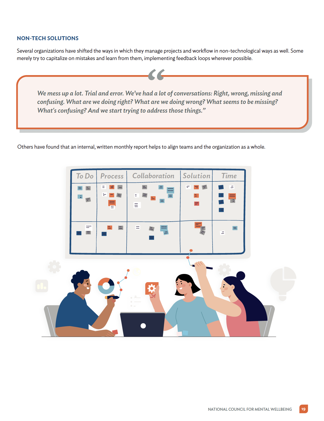
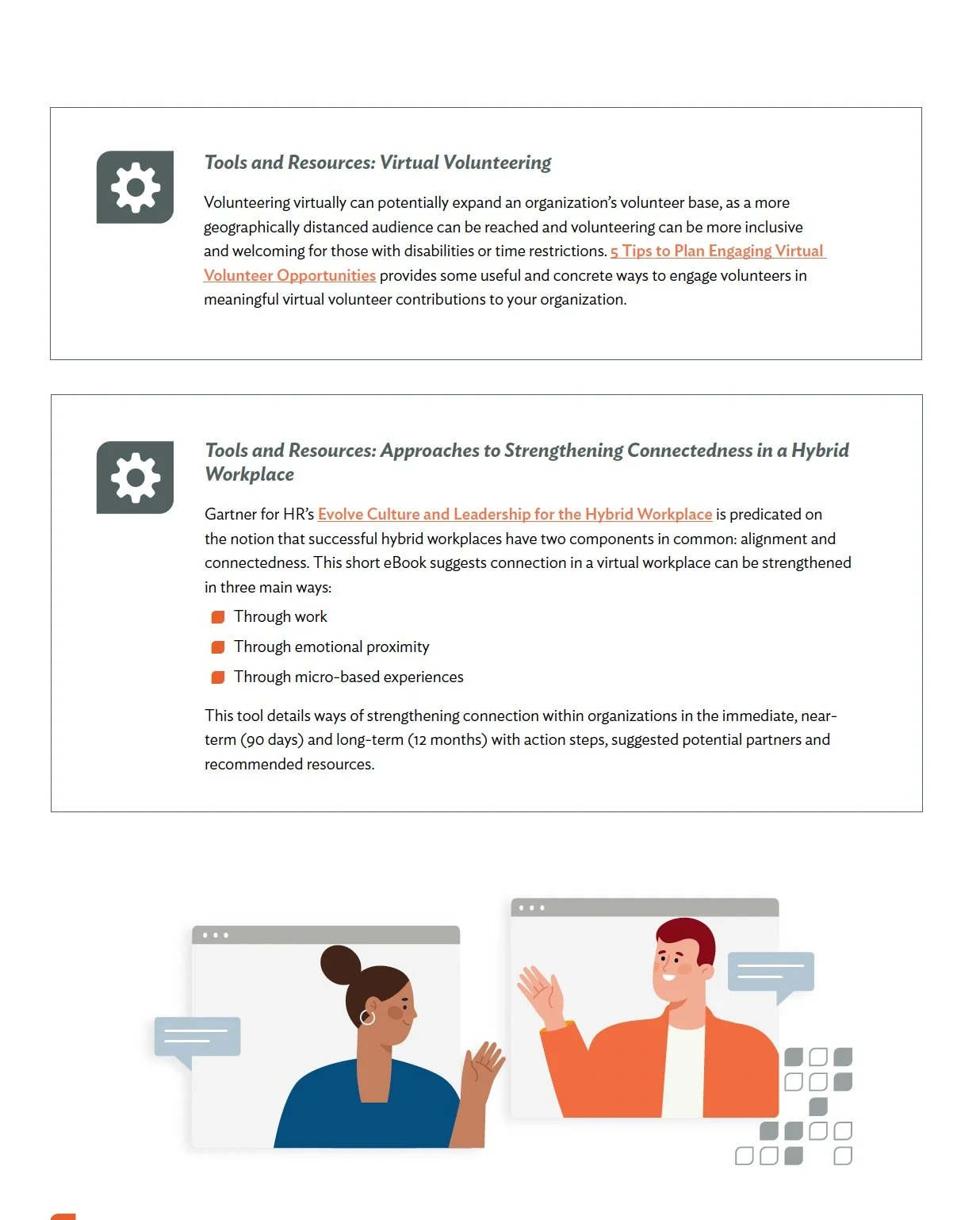
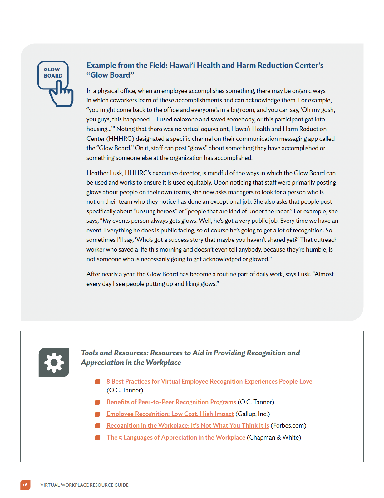
Maintaining Connection: Toolkit
BRIEF
Objective: Create a Toolkit that tells a story and visually reaches the intended audience, the written paper should be organized by strategy and geared to address some of the primary challenges of operating a team-based virtual or hybrid workplace.
Outcome: I produce a series of illustrations, adhering to the brand palette and style of drawings, visual elements like iconography and bullets to organize the information, also understand better the message intended.
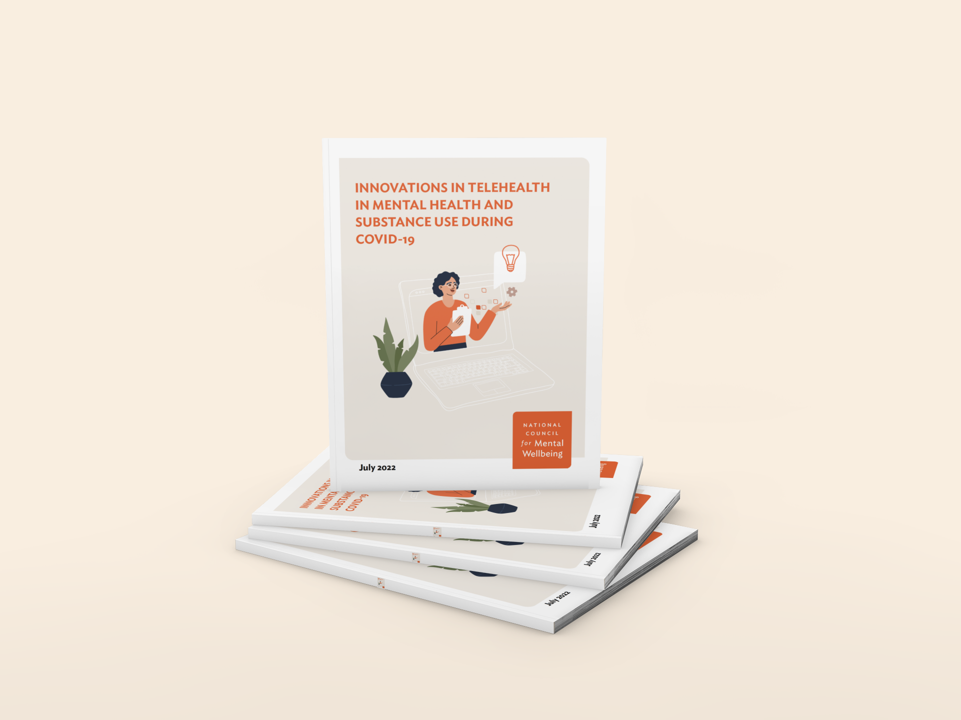
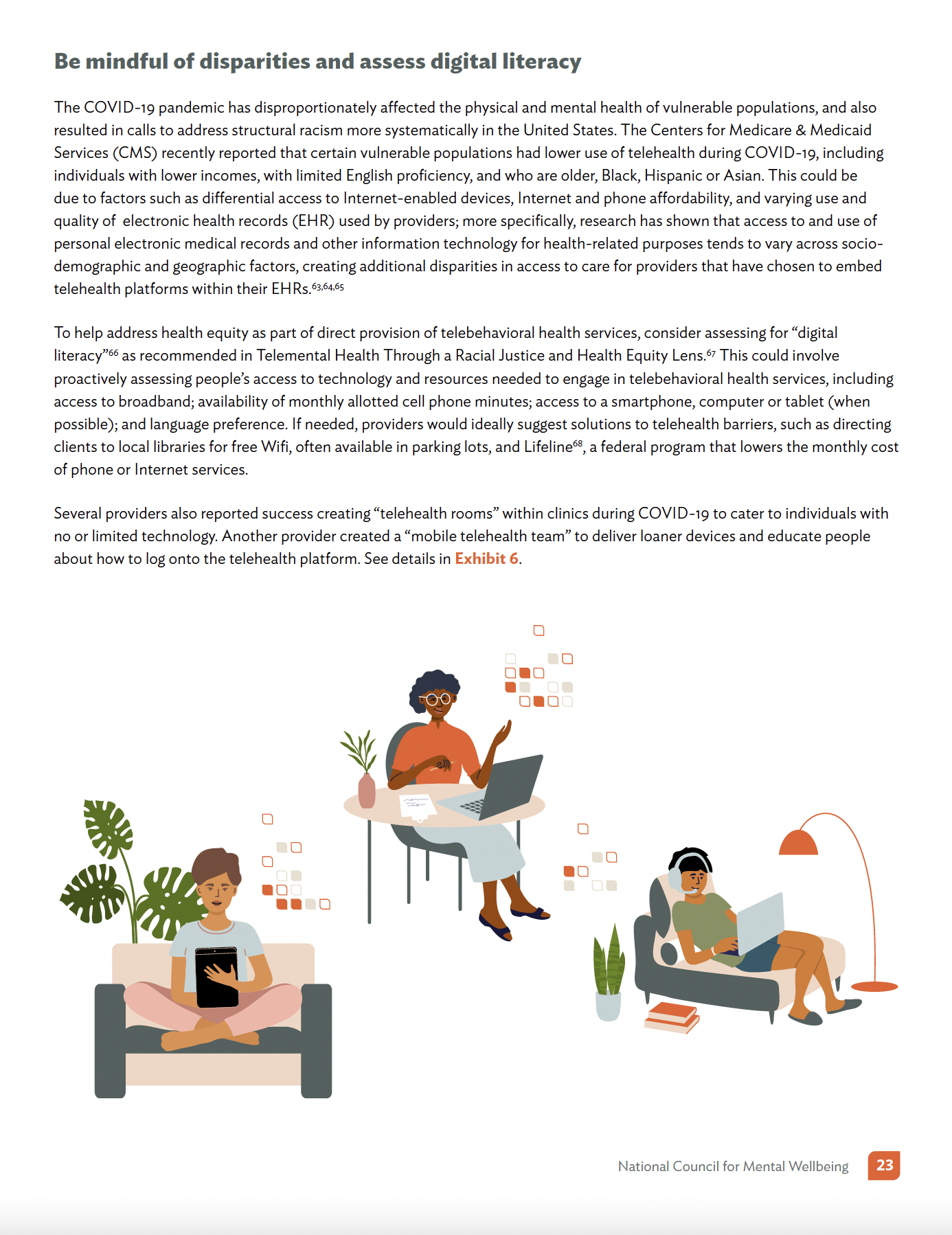
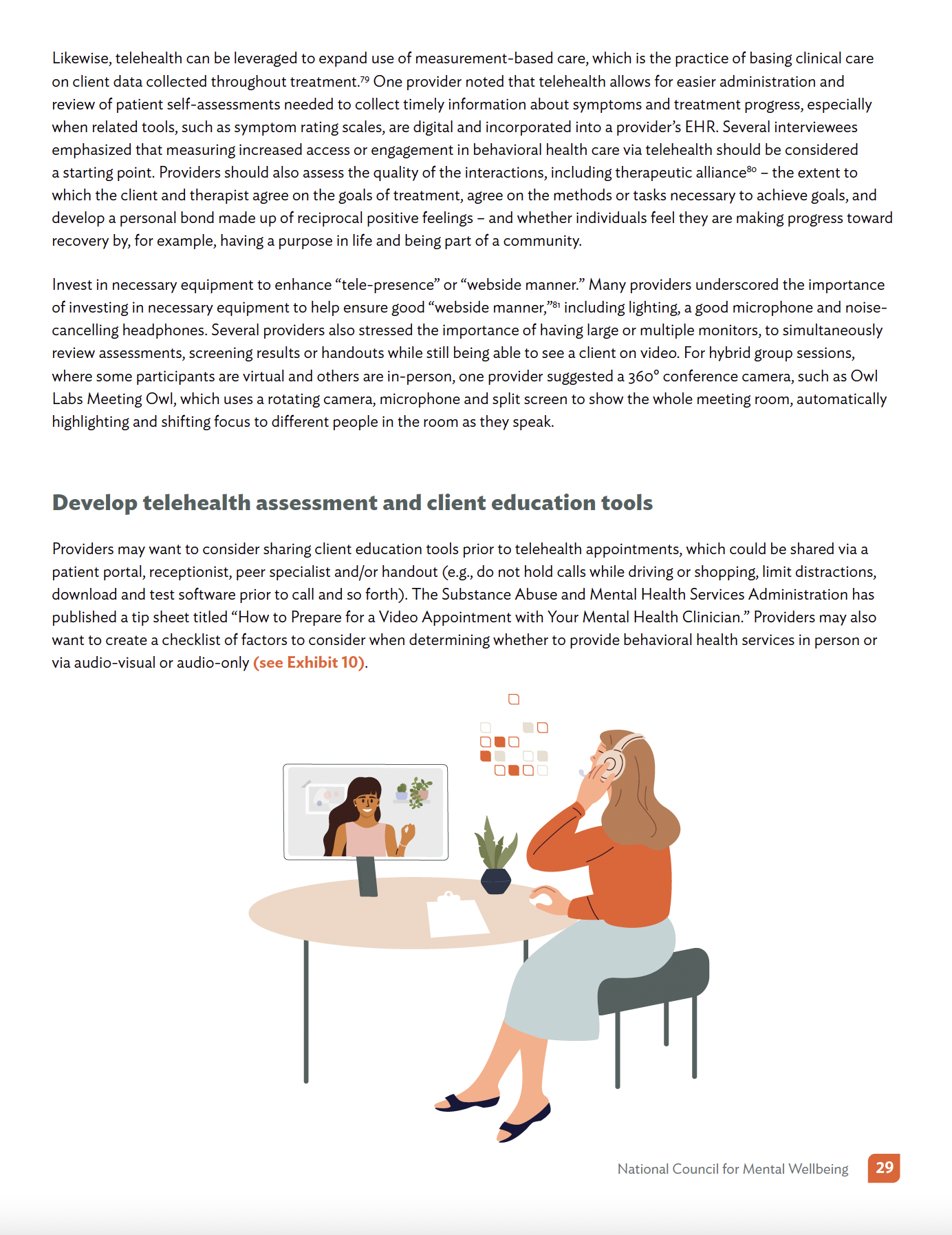
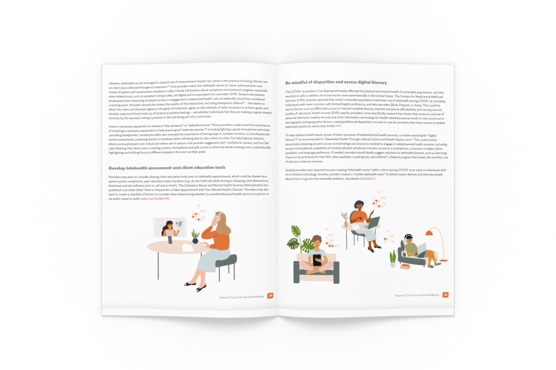
Innovations in Telehealth Toolkit
BRIEF
Objective: Create an engagement toolkit in what would normally be considered a boring, fact-filled, academic white paper. We want it to be professional and informative while also being accessible to folks. Add illustrations, images and colorful design elements to create that accessible feel.
“Its about the balance."

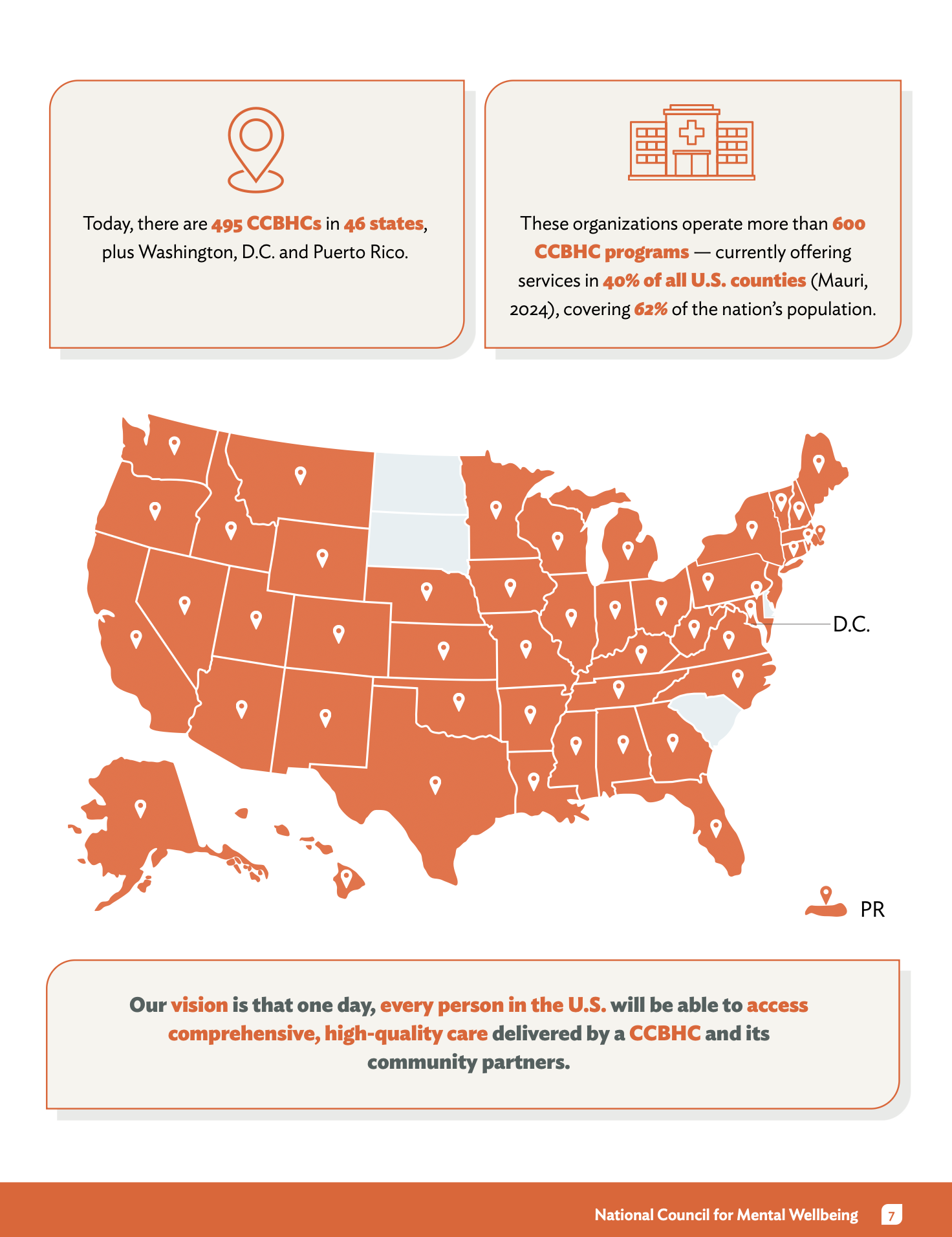
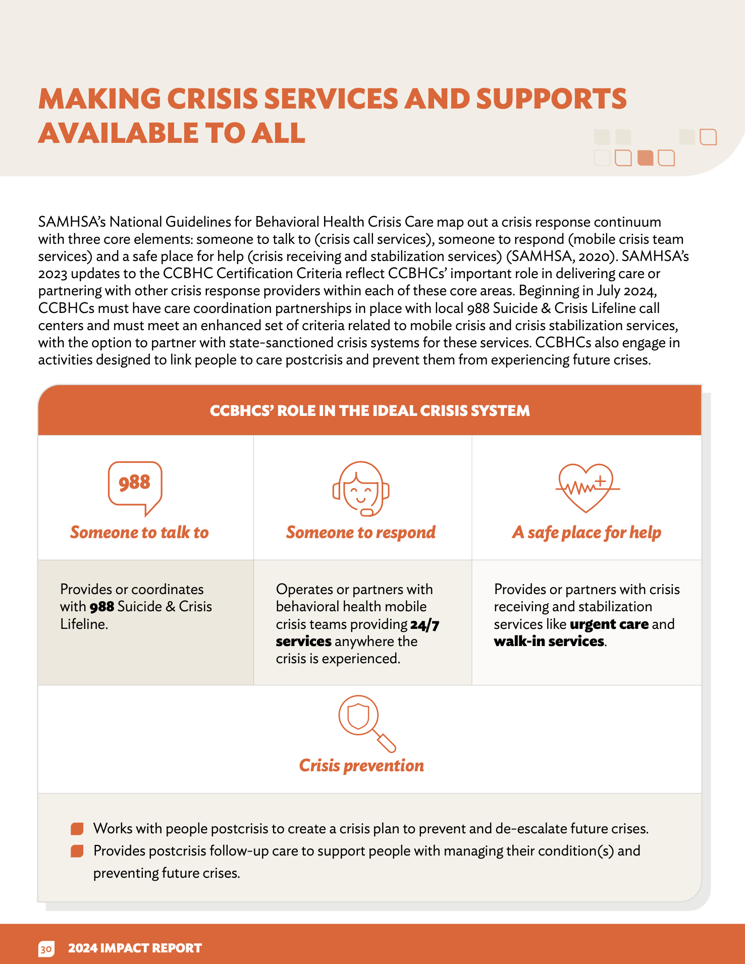
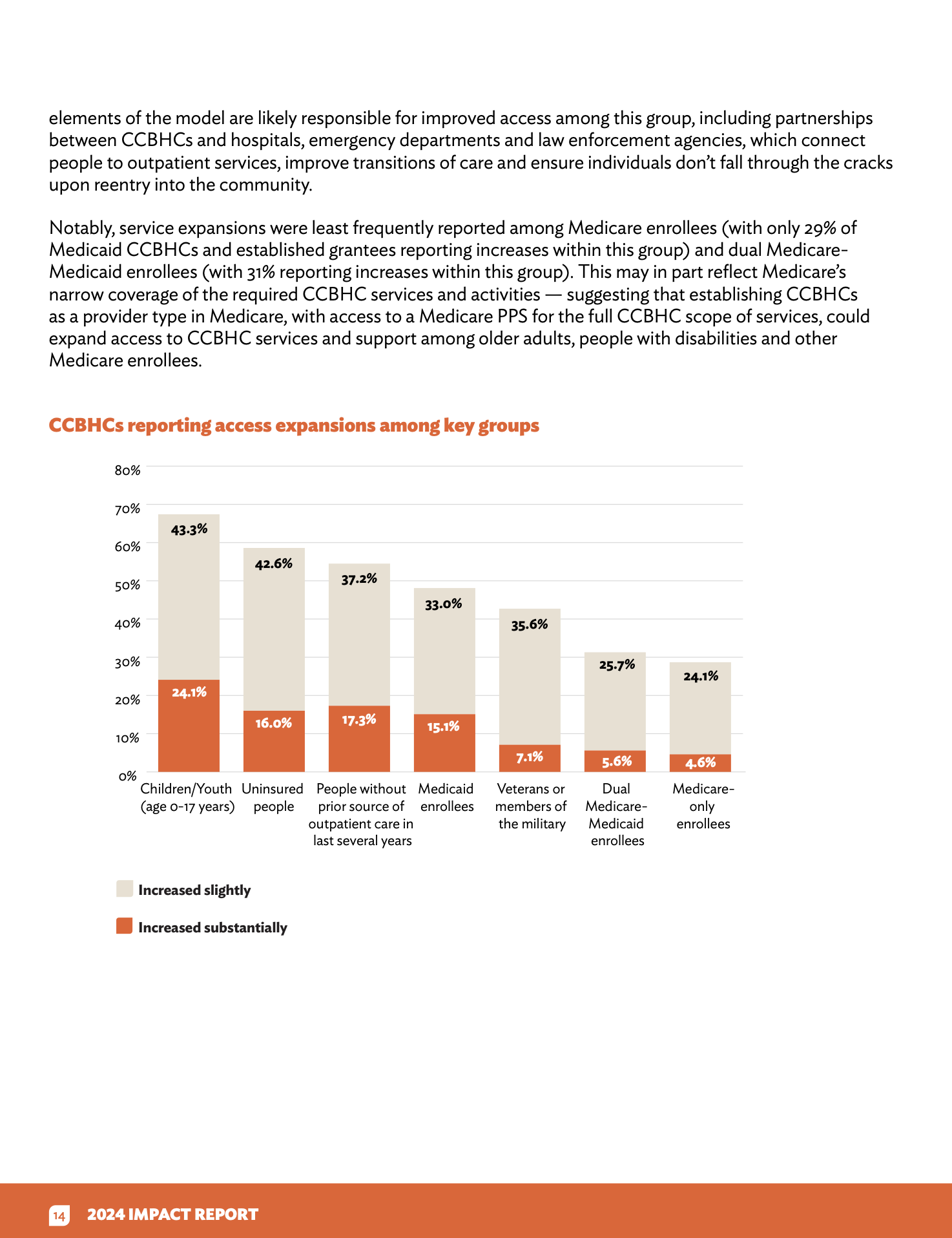
Case Study: 2024 CCBHC Impact Report
The Challenge
The CCBHC (Certified Community Behavioral Health Clinic) model is a cornerstone of US mental health policy. For the 2024 report, we needed to transform a massive volume of survey data from over 300 clinics into a compelling, accessible advocacy tool. The challenge was to make dense, technical information understandable for a wide audience, ranging from rural clinic directors to members of Congress.
My Approach
1. Information Architecture & UX Strategy
I treated this report as a functional user experience rather than a static document.
Hierarchical Navigation: I structured the layout to support different "reading speeds." Policy makers can get the high-level takeaways via bold pull-quotes and summary cards, while researchers can dive into the granular data sections.
Narrative Flow: I balanced cold statistics (like the 33% increase in people served) with human-centered storytelling. By placing success stories in visual proximity to the data, I ensured the "human impact" was never lost in the numbers.
2. Visual Storytelling & UI Design
Data Visualization: I translated complex SAMHSA certification requirements into intuitive icons and infographics. I focused on creating a "visual shorthand" for the report’s key pillars (Workforce, Crisis Response, and Youth Services) so readers could orient themselves instantly.
Strategic Branding: Using the National Council’s visual identity, I applied a professional yet urgent color palette that communicates authority. I designed the report for digital-first navigation, ensuring the layout remains high-fidelity whether viewed on a tablet or printed for Hill Day distribution.
BRIEF
Role: Graphic Designer & Accessibility Lead
Client: The National Council for Mental Wellbeing
Focus: Information Architecture, Data Visualization
3. Accessibility as a Core Feature (Inclusive UX)
As the lead accessibility designer, I didn't treat Section 508 compliance as an afterthought.
Semantic Structure: I built the document with a rigorous tagging system and logical reading order to ensure a seamless experience for screen-reader users.
Visual Inclusivity: I optimized color contrast for every data visualization and wrote descriptive alt-text for complex charts, ensuring that the critical data regarding our nation's mental health crisis is accessible to everyone, regardless of ability.
The Impact
The 2024 report is currently the primary advocacy tool for the expansion of the CCBHC model. By combining strategic visual design with a commitment to inclusive UX, I helped the National Council present a clear, data-backed case for the transformation of mental health and substance use care in America.

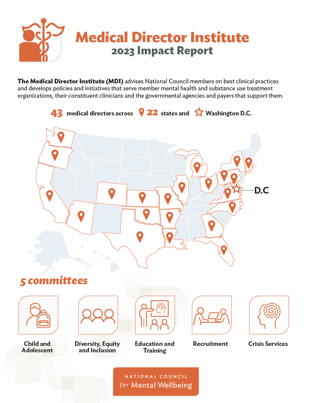
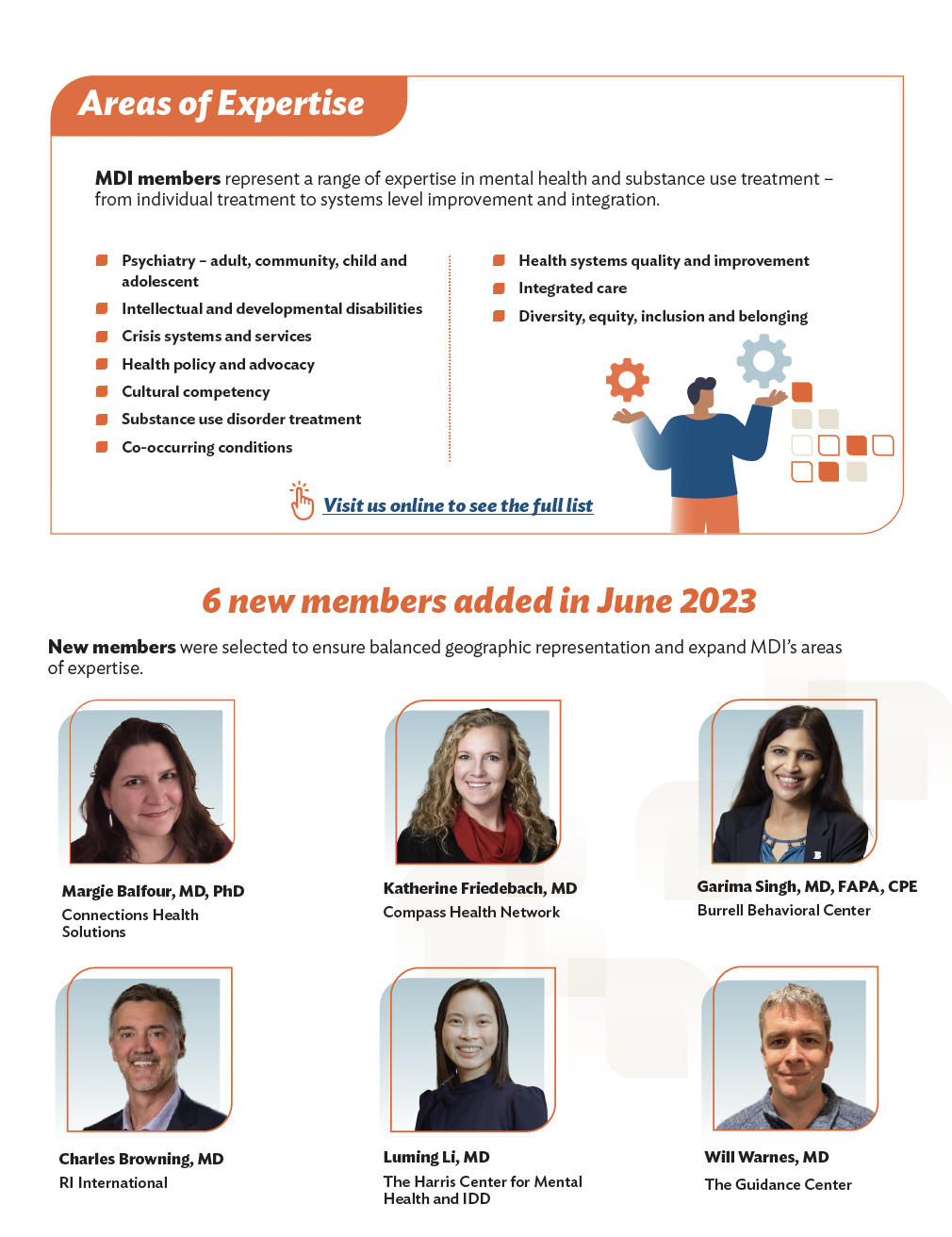
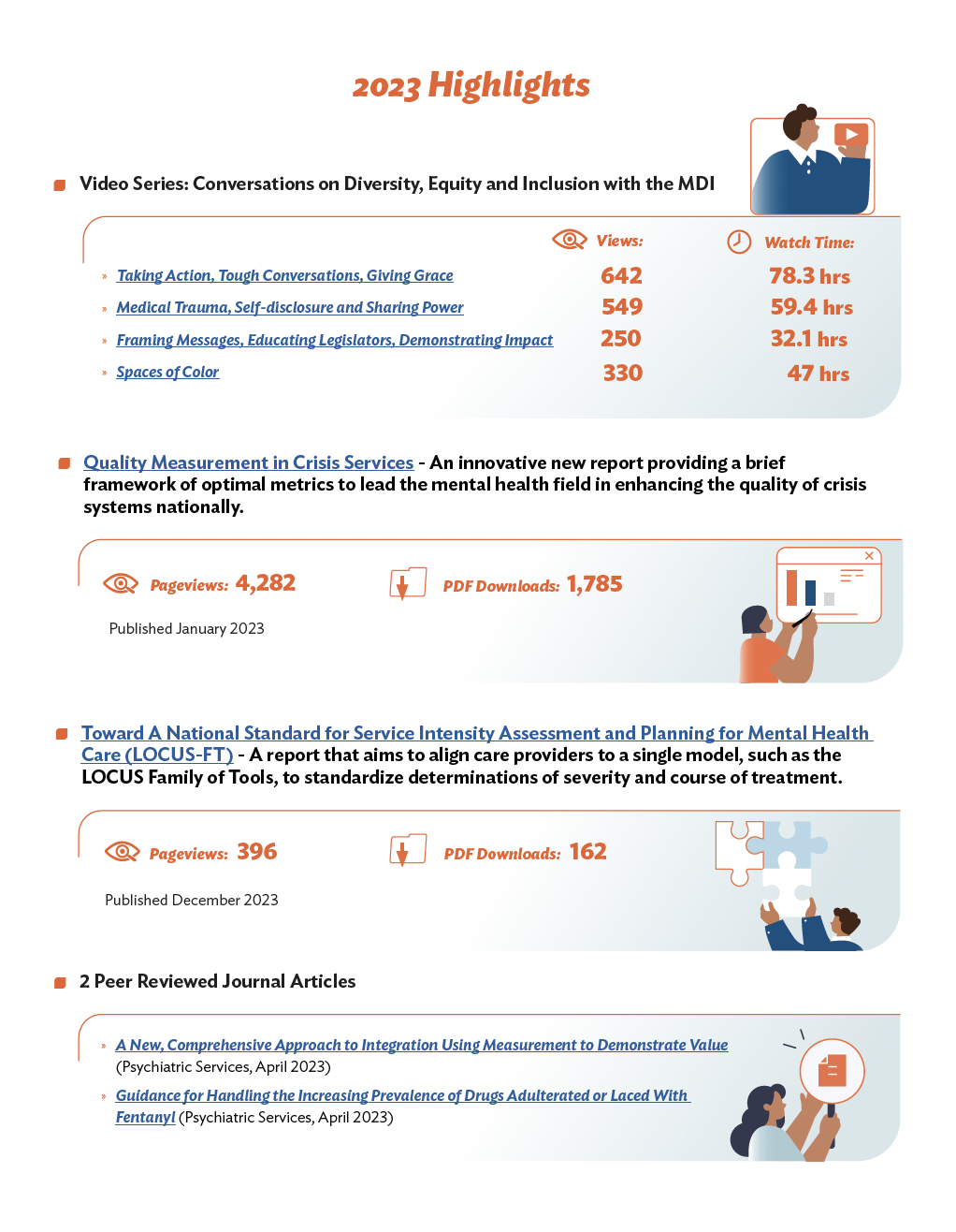
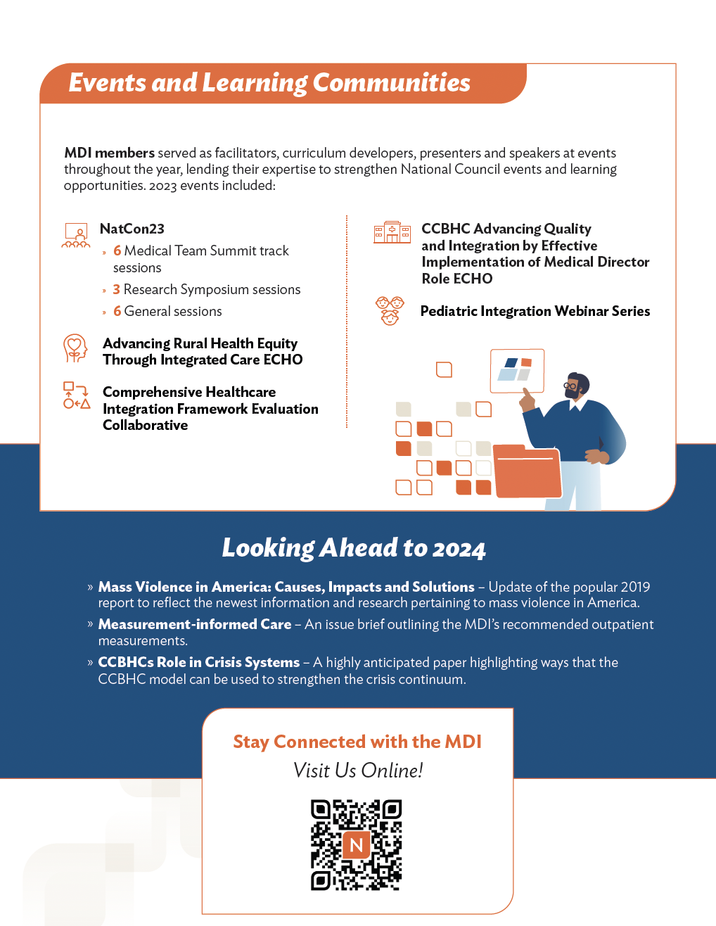
Case Study: Medical Director Institute 2023 Impact Report
Goal: Transform high-level clinical frameworks and policy data into a human-centered, easy-to-navigate digital experience for medical directors and healthcare leaders.
The UX Challenge: The MDI report is packed with technical topics like "Measurement-Informed Care" and "Crisis Service Metrics." My mission was to prevent "information overload" by creating a visual system that balanced clinical authority with clarity.
My Approach (UX/UI Highlights):
Accessible Data Storytelling: I translated dense statistics into intuitive infographics and community maps, ensuring the impact on the people served was the first thing a reader noticed.
Strategic Navigation: I structured the layout to follow a "Scan-to-Deep-Dive" flow. Busy clinicians could grab the "Impact by the Numbers" highlights in seconds, while clear typographic hierarchy guided those looking for detailed clinical papers.
Inclusive Design (508 Compliance): As the accessibility lead, I ensured that every chart, color choice, and document structure met Section 508 standards, making critical medical insights available to everyone, regardless of how they access the information.
The Result: A clean, professional, and accessible report that supported the National Council’s mission. By focusing on narrative flow and visual mechanics, I helped turn a complex 2023 summary into a strategic tool for clinical advocacy and leadership.